

If you have time, or if you're in need of a photographer, you should definitely check out Katie's site. I'm impressed by the business she's building and the work she's doing.
I'm so pleased with how this logo turned out that I wanted to share a little of the behind-the-scenes process.
To start off, I sent Katie a list of questions about her business. Once she sent it back and I had spent some time perusing her Web site and learning about her business, I started brainstorming words and concepts that went with Katie Campbell Photography:

After that, it was time to start sketching ideas:

I had several pages of sketches done before I was ready to start putting logo possibilities together. Below are some of the first logo concepts I sent to Katie, along with explanations about each of them.
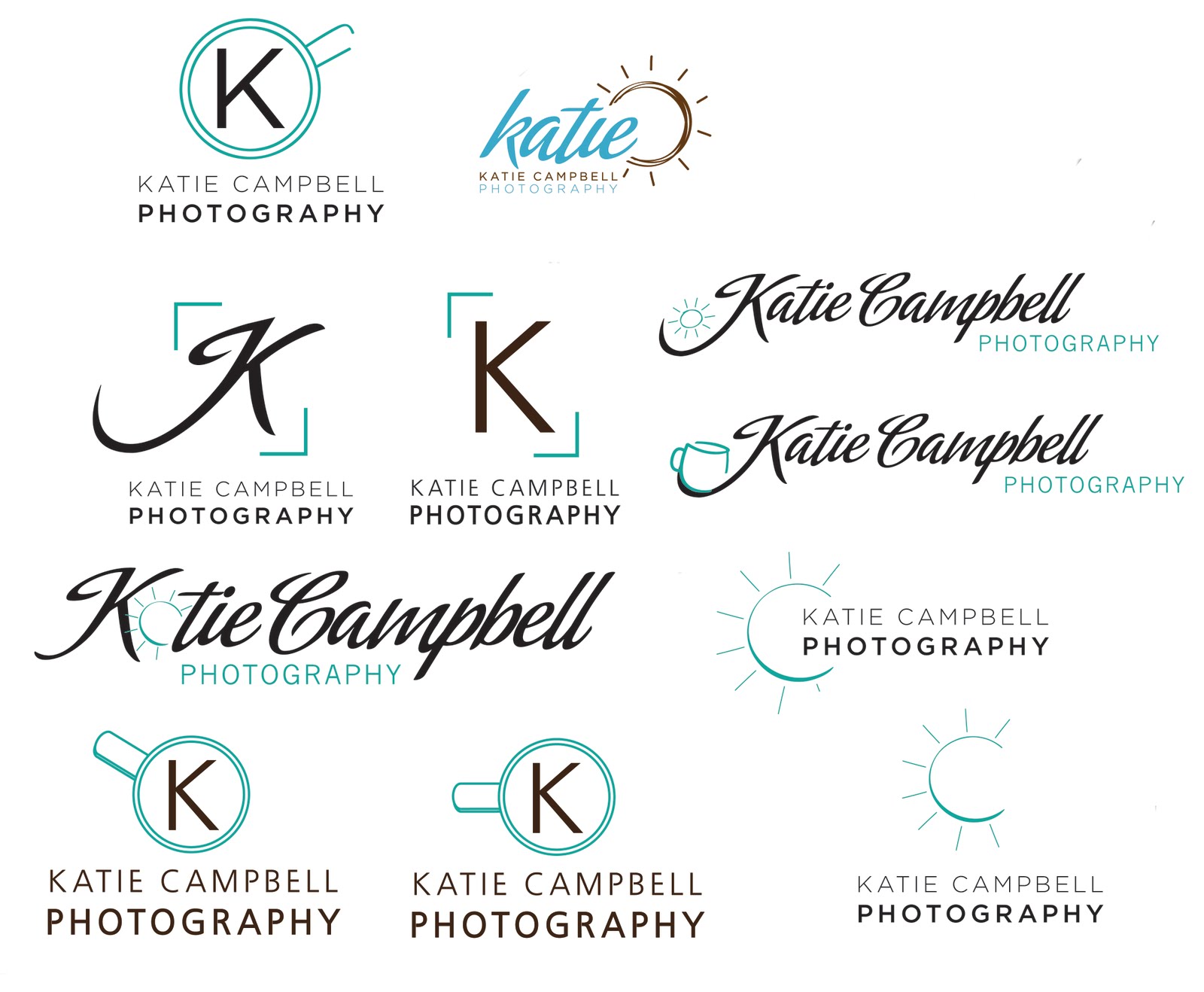

We chatted again about some of the details that would make the logo even more suited to Katie's desire to have it really 'pop.' I sent a final round of revisions, with variations on the color, the style of the 'K,' and the texture of the sun.

Katie chose the variations that fit the perfect style she was looking for, settled on a color scheme that worked nicely with her existing blog, and we had our logo:
It was such a blast to get to work on this project with Katie. Small business owners and creative people are some of my very favorite clients, and I'm thrilled to have been able to help Katie find her identity.


No comments:
Post a Comment